Fall of 2020 has finally arrived, and we have officially endured six months of hearing people kick off Zoom calls with “in these unprecedented times…”. And while on one hand that is a phrase that 100% never gets overused or annoying (it never misses), it also does serve as an unavoidable reminder of how much we have had to re-think the normal order of things.
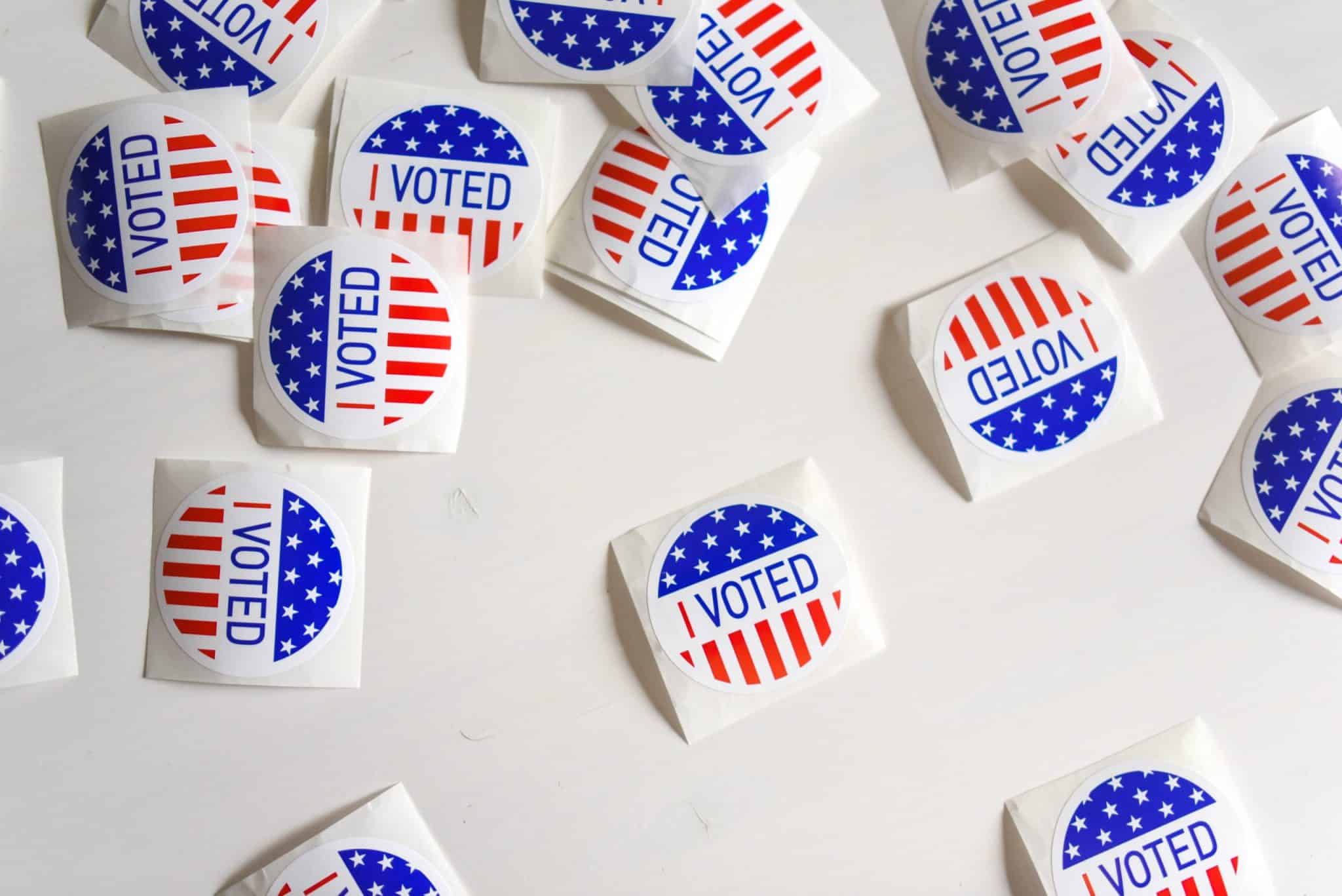
Equally unavoidable this year has been the 2020 general election, which serves as a perfect example of the kind of age-old established process that has to be reinvented more or less on the fly. At the moment, it seems like the main solution to avoiding the hazard of large crowds at polling places will be to rely heavily on mail-in ballots. As anyone who has already applied for one of these knows, it is an incredibly complicated process and one where a seemingly insignificant mistake could mean a discarded vote.
I recently applied for a mail-in ballot, and noticed how applying some basic design principles to the online experience of applying for a Vote By Mail ballot in Chicago could vastly improve the experience of mail voting — and possibly improve civic engagement in the upcoming election.
These Unprecedented Times
In an effort to shrink crowds at polling places in November, Governor Pritzker and other officials have taken steps to encourage citizens of Illinois to vote using mail-in ballots and have passed laws to make it easier to apply online to “Vote By Mail”. As of August there has already been a huge response, with around 230K Chicago voters applying to vote by mail — shattering a previous record of 116K voters during the 1944 election, which took place during WW2.
And while it’s amazing to see a high turnout of voters in an election year, this kind of sudden and giant jump in mail-in ballots may pose a logistical nightmare for the system being asked to run it. We are already seeing a disconnect between the timelines being communicated by state officials and what the post office can handle. Earlier this summer USPS General Counsel Thomas Marshall warned Illinois officials that “certain state law requirements and deadlines appear to be incompatible with the Postal Service’s delivery standards.”
The Chicago Election Board’s Vote By Mail Website
TLDR: Voting By Mail is a great option that should be provided to help citizens participate safely in a democratic process amidst a global pandemic. That said, there are a lot of steps, a lot of confusing rules, a ton of deadlines, and a myriad of possible mistakes that could mean your ballot is marked invalid and thrown out, even if you’re being careful.
For that reason, it is really important that the websites the government sets up to walk people through the process and rules of mail-in voting should be easy to use and understand. The quality of these websites can vary based on the level of government and geography, but since I live in Chicago, I want to focus on the Vote By Mail page set up by the Chicago Board of Elections.

Now of course, we live in a world with practical constraints where things like city budgets mean that the Board of Elections probably doesn’t have thousands of dollars to throw at a fancy design team who can build the coolest and prettiest website of all time. But looking at the current build of this page, there are a lot of relatively simple fixes that could be made to improve the experience of users coming to this page. And with the stringent rules and timelines put around this process, that improvement could mean significantly more votes counted.
Information Architecture
A major concept in UX/UI design, especially when you are trying to maximize the usability of a digital product, is information architecture (IA). IA is essentially the practice of deciding how to arrange the parts of something in a way that takes the least effort for a user to understand. If you are able to design content, visual elements, and navigation in way where a user intuitively knows how to accomplish their task, it tends to lead to higher levels of user satisfaction. There are a lot of ways to create a good IA, but for me it helps to think about what the user needs to accomplish and then arrange content in a way that meets their goals and minimizes their frustrations.
Taking a look at the Vote By Mail page, you can see a lot of IA-related issues. At a high level I noticed the following:
- Three major sections outlining the process of Applying, Marking, and Returning Ballots
- A LOT of text content within each section
- Irrelevant, misplaced, redundant section content
- Multiple (sometimes redundant) inline hyperlinks
- Arbitrarily placed process overview video
- Date ranges, instructions, notices, and conditional statements buried in the body text
It took me several times reading through the page to feel like I had a grasp of what I needed to know — and that is a clear sign of ineffective IA.

In taking a stab at trying to fix some of these issues, I grounded myself in the questions that a voter coming to the site would have and what answers they would need to find. Then I organized these in order of importance and grouped like categories of questions together. Some of the most important questions I felt needed to be answered were:
- What are the most important instructions to know at each stage of the process?
- What are the key deadlines they need to be aware of, are there any disclaimers or calls to action that are also relevant for them to see?
By reworking the IA I wanted to remove excess and redundant information to reduce distractions from the essential content. Additionally, in spots where I found content that was important but not relevant to the section it was in, I created a new section so that it had its own space on the page.

Hierarchy
Now that I had a blueprint in the form of my updated IA, I wanted to bring it to life. To do this, I tried to figure out how the newly constructed information architecture could be reinforced by reworking the visual hierarchy. Visual hierarchy is another key concept used to design successful user experiences. In short, it uses principles like size, weight, space, and contrast to implicitly tell a user what is really important and what’s not. Having a clear visual hierarchy helps a user spend less time and energy figuring out what is going on.
Looking at the current Vote By Mail website, there are several problems with the visual hierarchy. Some of the main issues that stuck out for me:
- Use of several different colors to demarcate sections
- Inconsistent use of bold and highlighted text.
- Minimal differences between font size (creating huge wall of text)
While I understand that the intent of these decisions was to try and emphasize important information, these methods of establishing hierarchy are not effective in guiding a user’s attention toward the essential elements of the page.


The first problem I wanted to solve was breaking up the large and intimidating wall of text. I wanted to introduce more space between and within the sections.

I then played with the relative size of text on the page to establish a difference between section headers and navigational elements and the content.

In areas where it felt like sections of content had a unique purpose, I tried to implement alternative design elements (like cards) that present information in ways better aligned with how a user would need to interact with them. Doing so also had the added benefit of breaking up the monotony of the page.

I also replaced some of the inline hyperlinks with buttons. No moral judgment on inline hyperlinks — but the more obvious the calls to action on a page are, the less likely it is for a user to miss a form they need to fill out or another page they need to visit.

Also it’s just more fun to smash a big shiny button than it is to click a hyperlink (apologies to the hyperlink heads out there).
Visual Interest
The last thing I wanted to do was figure out how I could improve the look and feel of the page. Yes, voting is an important and serious thing, but why can’t we have a little fun in the process?
Of course my goal when I set out on this redesign was to keep it simple, achievable, and most importantly, cheap. So while that meant no fancy illustrations, motion graphics, or typography statement pieces… I did feel there were smaller-scale improvements that could be made while sticking to the existing styles of the page.
The first thing I wanted to figure out was how to add a little color to the page. A quick and easy solution to this was to use the existing blues on the site to create some differing section colors and improve scannability.

Next I drew some simple icons and visual indicators to graphically separate what it felt like the Board of Elections was trying to emphasize, such as key deadlines.

Lastly, I added some unlicensed free images to balance out all the text on the page. While overly generic images can feel irrelevant and highly customized photos can be an unnecessary cost, some well-placed photos can be really helpful. Especially for people who are visual thinkers, these pictures can serve as key landmarks or anchors on a page, helping users to understand where they are.

Looking at the redesigned page as a whole, it is definitely much longer than the original. But this is not a bad thing! A recent study by Nielsen Norman Group tested scrolling and attention and found that “While modern webpages tend to be long and include negative space, and users may be more inclined to scroll than in the past, people still spend most of their viewing time in the top part of a page.” For my redesign I made sure to account for this by including an Apply to Vote Online CTA at the very top and ordered the content in the sections from (at least what I assumed) was most important to least important.

You can view the whole redesign in detail here, on InVision.
What’s Next?
While I set out to make some broad and achievable changes to improve the experience of voters coming to this Vote By Mail web page, I made a lot of assumptions along the way. I assumed that the copy of the page all made sense and was necessary from a legal perspective. I also assumed that the design elements I made would be more intuitive and increase usability. However, the design process rarely occurs in a vacuum. If this was a client project, the next step would be to test these designs with real users and continue to iterate until the optimal state was reached.
Moral of the Story
The process of this redesign really drove home for me how design principles are becoming increasingly crucial in all aspects of daily life. Looking at the constraints in place for the current election, voters have a frighteningly thin margin of error to make sure their voice is heard. For that reason, it’s up to the state and local governments to do everything they can to construct and support an intuitive process.
If you’re a registered voter in Chicago and want to vote by mail in the November 3 election, be sure to visit https://www.chicagoelections.gov/en/vote-by-mail.html to request your mail-in ballot before the October 29 deadline!