The loyalty platform behind 2,000+ financial institutions' rewards programs.
ampliFI Loyalty Solutions runs customized credit and debit card loyalty programs for over 2,000 banks and credit unions across the United States. Their rewards portal is a white-label product: each financial institution's customers see a branded experience where they redeem loyalty points for event tickets, merchandise, charitable donations, or cash back.
The problem was scale. Every time a new client signed on, ampliFI's engineering team had to manually build a branded portal instance from scratch. The customization options were limited, the process was slow, and it didn't scale. ampliFI needed a platform that empowered their clients to self-service their own branding and configuration, while giving their end users (the cardholders) a modern, frictionless redemption experience.
Our team designed and built that platform: a complete UI overhaul with a modular component system, a self-service branding engine with automatic accessibility guardrails, a streamlined checkout flow, and 30+ API endpoints to power it all.
Every new client meant another manual build. That doesn't scale to 2,000.
ampliFI's clients loved their custom-branded rewards portals. The catch: each one was hand-built by ampliFI's engineering team. New client onboarding was slow. Brand updates required developer involvement. And the underlying user experience hadn't kept pace with consumer expectations.
Cardholders faced unnecessary friction everywhere. Redeeming something as simple as cash back required navigating through an online catalog, selecting "cash back" as a category, proceeding through a full checkout flow, and confirming the transaction. Four steps for something that should be one click. Commercial customers sometimes received duplicate notifications. The overall experience felt dated compared to what users encountered on Amazon, Starbucks, Nike, and every other retail site they visited daily.
ampliFI needed three things simultaneously: a self-service branding system so clients could manage their own portals, a modern user experience that competed with consumer-grade loyalty programs, and an architecture that could scale without adding engineering headcount for every new client.
Cash-back redemption: the old 7-step journey
Cardholders hit two redundant verification screens just to redeem cash back. What should have been one click stretched into seven steps — the middle of the journey spent re-checking what the cart already showed.
Research first. Then build exactly what the research says to build.
We started with 17 stakeholder interviews before touching a single wireframe. That research produced 12 key insights that drove every design and engineering decision. No guessing. No assumptions. Just evidence translated into product.
User & stakeholder research
Interviewed 17 stakeholders across ampliFI's organization to map pain points and opportunities. The conversations spanned product, engineering, customer success, and sales. We distilled 12 key insights that directly informed every design and engineering decision that followed. Not a single pixel got placed without a research rationale behind it.
Competitive analysis beyond financial services
Here's the insight that changed the project's direction: cardholders don't compare ampliFI's portal to other bank websites. They compare it to every retail experience they use daily. Amazon. Starbucks. Nike. We benchmarked against consumer loyalty leaders, not financial services competitors, because that's the bar cardholders actually measure against. The standards for a "good" rewards experience are set by consumer tech, not by banking.
Journey mapping & friction reduction
Mapped the full cardholder journey from financial institution homepage to reward redemption. Identified critical bottlenecks, especially the multi-step cash-back redemption flow. The old path: land on portal, browse catalog, find cash back, add to cart, proceed through checkout, and confirm. We designed direct paths that cut unnecessary steps entirely, getting cardholders to the thing they wanted most in a single click.
UI/UX design & component system
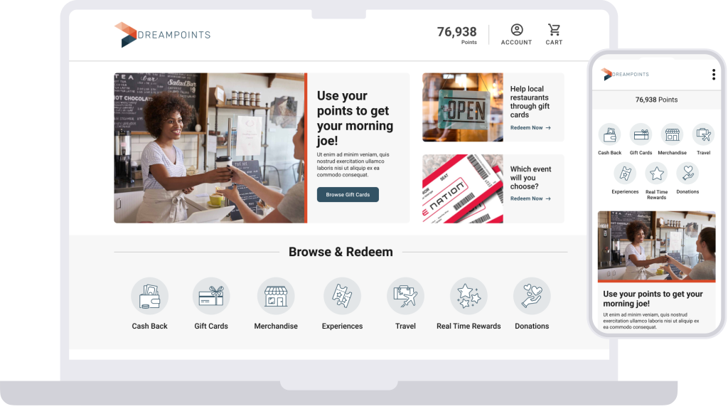
Produced a modern, modular interface with white-label flexibility built into the foundation. Every component adapts automatically to a financial institution's brand identity. A custom icon library covers all 7 redemption categories and recolors dynamically. Toggle-based feature configuration means each institution gets exactly the features that match their offerings, nothing more, and nothing less.
API platform design & development
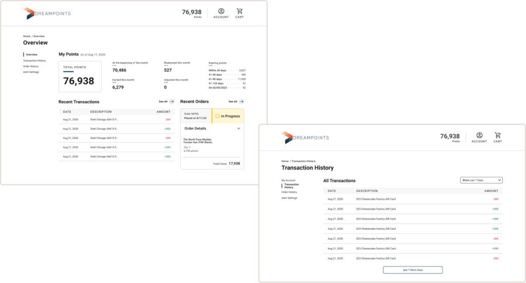
Collaborated with ampliFI's engineering team on 30+ API endpoints covering authentication, program settings, branding configuration, account data, catalogs, cart management, and order placement. Built a Node proxy server for efficient remote data fetching with caching, keeping the front-end responsive while the back-end handles the complexity of serving 2,000+ tenants.
Research-to-delivery process
Five phases, each building on the evidence gathered in the phase before it. Research drove design. Design drove architecture. Architecture drove implementation.
A white-label platform that scales itself.
The platform we built with ampliFI does four things that their old system couldn't: self-service branding, automatic accessibility enforcement, streamlined redemption, and modular component reuse. Each piece reinforces the others.
Self-service branding engine
Financial institutions can now configure their own portal branding without touching ampliFI's engineering team. Color palettes, logos, and feature toggles; the whole identity layer is self-service. What used to require a developer now takes a marketing coordinator fifteen minutes.
Automatic accessibility guardrails
Here's the tricky part of white-label: when clients choose their own brand colors and typefaces, they can accidentally create combinations that fail accessibility compliance. We built guardrails that give clients maximum creative flexibility while preventing non-compliant combinations. Color fallbacks activate automatically, and the system surfaces warnings when a chosen combination is problematic. Maximum freedom, zero compliance risk.
Streamlined checkout & cash-back redemption
Previously, redeeming cash back required navigating the full catalog, selecting cash back as a category, proceeding through checkout, and confirming. We built a direct cash-back redemption path that skips the catalog and checkout entirely. One click instead of four steps. The most common reward action became the simplest.
Modular component library
Every component adapts to the financial institution's brand identity automatically. The icon library covers all 7 redemption categories and recolors dynamically based on brand configuration. New institutions onboard with a fully branded portal without a single custom build.
Cash-back redemption: before and after
White-label platform architecture
One core platform powers every financial institution's branded portal. Each tenant inherits the full component library, applies their own brand configuration, and serves their cardholders independently.
From manual builds to self-service at scale.
ampliFI's rewards portal now serves their clients and their clients' cardholders without requiring custom engineering for every new brand. The platform scales on its own.
By designing for white-label use from the ground up, ampliFI no longer manually builds portal instances for new clients or handles branding updates. Clients self-service their portal configuration, and the experience their cardholders see competes with consumer-grade loyalty programs from Amazon, Starbucks, and Nike.
The modular component library and API platform give ampliFI a foundation that scales with their business. New clients onboard faster. Existing clients update their branding independently. And the accessibility guardrails ensure every branded instance meets compliance standards, regardless of the color choices a marketing team makes on a Tuesday afternoon.