

The ability to sort through a huge variety of items to find the most relevant is part of the reason digital technology found its way into our lives in the first place. Nowadays, searching the internet and browsing websites often feels like second nature, yet if we stop to look closely, the conventions we rely upon can appear arbitrary and occasionally bewildering. One aspect of browsing information that causes confusion on almost every one of our client projects is filtering.
Before jumping in, here’s an example anyone could encounter while online shopping. Imagine that you’ve been looking for some new sneakers. You found a website you’ve ordered from before, and navigated to the “Sneakers” page.
You see a list of all sneakers this company sells. There are 817 of them! You’ve been thinking about getting some black sneakers though, so you don’t want to look through all 817 options. You open up the filter panel and find the color filters. You select “Black” and suddenly see a much shorter list showing only black sneakers, about 300 in total. But now that you think about it, dark blue sneakers could be cool too. So you also select “Blue” and now see 380 black sneakers and blue sneakers.
If you were to keep selecting different colors–“Brown,” “Gray,” “White,” etc.–you would keep adding to the number of sneakers you see on the page until eventually you’re back to 817. At that point you would have all color filter values checked, but you’d be back where you started without applying any filters! The implications of this become confusing on many different projects.

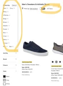
- No filters selected compared to all color filter values selected. The results are: the same?? [nordstrom.com]

This is one of several confounding situations we find when working with filters, whether they’re for ecommerce (like the sneakers example), messaging customers on an energy grid, keeping track of applicants, or monitoring security devices, to name a few recent project examples.
In this post we’ll look at three conventional design patterns that can cause confusion, and how to design for them. While it’s generally not a good idea to propose new conventions, what we can do is carefully listen to our users and be thoughtful about how we design around these unspoken rules. We’ll start by understanding what a filter is.
Are we more interested in what we’re taking out, or what we’re passing through? In other words, what does a selected filter mean?
The conventional design pattern
We select the information we want to pass through our filters. Selecting a filter value means we want to see items that have that value as an attribute.
Why this is the convention, and how it can be confusing
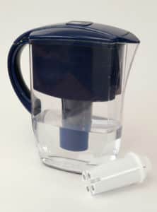
It’s helpful to think about a filter as a real object, such as a water filter for drinking or an air filter in a car (or, as we’re very conscious of right now, COVID masks). But, when we’re filtering information in a user interface, our filter is slightly different from most physical filters. For physical filters, like water filters, we’re interested in what it filters out, like harmful chemicals or plastic particulates. But when we’re trying to narrow down information in a digital application, we’re usually (though not always) interested in what information passes through.
In this way, most user interface filters are more analogous to light filters. For example, a green light filter filters out all wavelengths of light except for green, but what we care about is that it passes through green light. Just like with light filters, on applications we generally prefer to select what we are looking for rather than what we aren’t looking for.
-
For water filters it’s important what is filtered out. [Image]

-
But for a light filter it’s important what passes through, much like user interface filters. [Image]
How to design for it
There’s not much we can do with this one; it’s fundamental to how interface filters behave. Use the convention that selecting a filter value means you want information with that filter value as an attribute to pass through. Otherwise you risk creating a pattern that works the opposite way of most applications and will likely result in users thinking your system is broken.
Are filters selected or deselected by default?
The conventional design pattern
Filters are not selected by default; we select which filters will show information we want to see.
Why this is the convention, and how it can be confusing
In the shopping-for-sneakers example above, having no filters selected showed the exact same number of sneakers as having all color filter values selected. So why not just have all filters selected to begin with?
If you’re shopping for something at a brick-and-mortar store, a salesperson would ask you “what are you looking for today?” so they can narrow things down and help you find something. They don’t say “first, tell me all the things you aren’t looking for.”
For that same reason it is usually cumbersome to deselect everything we don’t want to see. That’s why the most common design pattern is for filters to start deselected, and for users to select which filters will show information they want to see.

-
The conventional design pattern is that filters are not selected by default. [nordstrom.com]
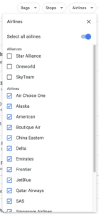
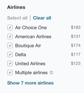
However, this convention is not the best choice for every use case. When searching for flights, the “Airline” filter on some sites has all airlines already selected by default. Users can deselect any airlines they don’t want to see. This is likely because travel sites have noticed that people are usually more interested in which airlines they don’t want to use than which they prefer to use.
-
In a modification to the conventional design pattern, Google Flights and Kayak.com have all airlines selected by default.
How to design for it
Listen to your users. If they are more interested in choosing the attributes they want to see, leave the filters deselected by default. But if they are more interested in choosing attributes they don’t want to see, consider starting with the filters selected by default.
The Google Flights and Kayak airline filters are great examples of how a conventional design pattern can be altered based on observed user behavior. The examples work because they follow how people think when looking for certain information, even if it’s not something that is consciously noticed. Yet you’ll also notice in both examples how easy they make it to deselect all the airlines: this helps show that the convention has been broken and users can switch back if necessary.
How should different filter selections be combined?
The conventional design pattern
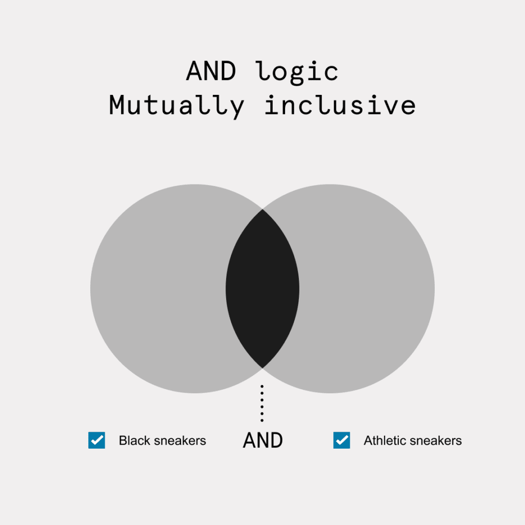
Filter values that are mutually exclusive use OR logic (I want to buy either black sneakers or blue sneakers, so I see both options), and filter values that are mutually inclusive use AND logic (I want to buy black athletic-style sneakers, so I only see sneakers that are both black and athletic-style at once). In practice this means that within a filter, values can be combined with OR or AND logic, but between different filters AND logic is almost always used.
Why this is the convention, and how it can be confusing
Because this convention relies on rules of logic, it can be difficult to remember. It helps to understand the user behavior it supports.
In the shopping for sneakers example, when you checked off multiple options inside the Color filter (“Black” and “Blue”) it showed you more items than checking one option (“Black” only). Essentially you’re saying “I want to buy either black sneakers or blue sneakers.” This is because color is considered mutually exclusive for shoes: each pair is classified as only one color (though as discussed later it doesn’t have to be defined this way; other examples of filters that are mutually exclusive are price range or brand).
But if you check “Black” in the Color filter and then check “Athletic” in the Style filter, you’ll end up with fewer items than black sneakers only. This is the typical convention for interface filter logic, which is that filter values that are mutually exclusive use OR logic (I want to buy either black sneakers or blue sneakers), and filter values that are mutually inclusive use AND logic (I want to buy sneakers that are both black and athletic).

-
OR and AND logic can be thought of like a Venn diagram. When filter values are mutually exclusive they use OR logic, when they are mutually inclusive they use AND logic.


-
“Black” OR “Blue” sneakers are mutually exclusive, showing more results. “Black” AND “Athletic” sneakers are mutually inclusive, showing fewer results. [Nordstrom.com]
While you may not have thought about it, this convention is so common that if a filter behaved differently it would be super confusing. Imagine if you selected “Black” sneakers in the Color filter and “Athletic” sneakers in the Style filter, and you got a list of all black sneakers or all athletic sneakers. In addition to black athletic sneakers you would also see a bunch of athletic sneakers that weren’t black and black sneakers that weren’t athletic. You might think the system was broken.
OR logic is common within a filter, and AND logic is almost always the case between different filters. But AND logic can also happen within a filter if the values are mutually inclusive, such as hotel amenities.

-
This Amenities filter from Booking.com is an example of mutually inclusive filter values within the same filter. A hotel can have both parking AND a restaurant.
How to design for it
Follow the OR/AND conventions but listen to your users to determine the clearest way to apply attributes to your data. You don’t want your users to have to think about the difference between OR and AND logic – it’s confusing! You want the interface to intuitively support their behavior.
Where there is room to play is how values are attributed to the items that are filtered. Product teams should use the correct convention, but can change the way attributes apply to items to make filter values combine in appropriate ways. This should be done by understanding the unique user behavior for each filter in the application.
In the shoe shopping example, what if you were looking for sneakers that were multicolored black and blue? Because most sites attribute shoes with just one color, you’d be out of luck. You’d have to browse through all black or blue sneakers to find pairs that were both black and blue.
This is likely because online vendors have realized that shoppers tend to describe shoes with one primary color. While this may not always be the case, it’s likely why only one color is usually attributed to shoes.
If we instead observed that finding multicolored shoes was more important, we could classify shoes differently to make it easier for users to find multicolored shoes. For example, if each pair of shoes was classified as having as many colors as appear in the shoe, then the colors would no longer be mutually exclusive. If a color filter was built that asked you to select all the colors that could appear in a shoe, and you selected “Black” and “Blue”, what would you expect to see? You would probably expect to see only shoes that were black and blue, as the convention describes for mutually inclusive values.
These are a few filtering confusions we repeatedly encounter in our product design work. The issues may appear simple at first, but user interface filters have layers of nuance. When you run into challenges, start with the conventional design pattern and then thoughtfully adapt it to the specific needs of your users, filter by filter.


