Unless you’re completely off the grid (in which case, how are you reading this blog post?), you interact with icons everyday. Icons are a shorthand that helps navigate people through websites, apps, software, and countless other parts of our lives.
There are a lot of great pre-designed icon sets available for licensing, but sometimes a project calls for a custom set of icons that showcase a brand’s unique visual identity. We recently created a custom set of seven icons for a client in the financial services industry. Here’s a behind-the-scenes peek at our process.
Challenges
For this particular project, we had a few main challenges to conquer:
Color
We were tasked with creating icons for a product that our client will white-label for different customers. This means that the icons need to work with thousands different brand identities, using thousands of different color palettes.
In theory, you could apply any color to any icon–but in reality, some color choices may lead to accessibility issues for users with colorblindness, low vision, or other visual impairments. It’s important for any product to be designed with color contrast that enables anyone to perceive and understand what the text, icons, or imagery conveys. To solve for this, we created a default color palette that meets recommended accessibility ratios, and documented strict rules for color application so color contrast remains controlled.
Responsive Icons
Another challenge we faced was creating an icon set that translates well between desktop and mobile. In their mobile form, each icon will be about ⅙ of the size it is on desktop–but it needs to communicate the same meaning. Mobile icons generally have less detail than desktop icons, so we had to think about forms that were clear enough to lose a lot of detail and still be effective.
Our Icon Creation Process
Research
During the research phase, we identified our goals and challenges, and defined what we were trying to represent through iconography.
Then, we conducted a landscape analysis using resources like the Noun Project and Dribbble. Dribbble is a very trendy resource right now, which has led to a lot of design seeming “dribbblified’–sometimes it seems like everything is flat with color and stroke. We wanted to avoid ‘dribbblification,’ but it was nice to explore some different ways of thinking about applying color. We also looked at other financial institutions to see how users expect icons to look within the financial space.
Sketching
After the research phase, we began to sketch our ideas using Procreate and Sidecar. During the sketching phase we began thinking about how to create icons using the same size, carrying the same detail, and using the same strokes, so they’d be cohesive as a set. Together, we created many sketches which eventually turned into 25 top contenders.

Digitizing
Moving out of the sketching phase, we exported our top 25 sketches and put them into Adobe Illustrator to make them digitized. That’s when we had to think more precisely about the size and stroke, and what to take away or add to each icon to make them similar. With five options per icon, it was a lot to narrow down, but a cohesive icon set should abide by consistent rules: line weight, corner style, personality. It’s important to take the time it needs to get it perfect.

Testing
Once our 25 options were digitized and polished up, we had some ideas about our favorites. But at this point, we had been working with these icons so much that we knew we needed a fresh perspective. We created a short survey to collect feedback from colleagues who had not been working on the project, asking questions like “if you were to see this icon and knew nothing about our product, what does the icon communicate to you?”
Everyone responded a little differently. Some people were very straightforward with their feedback, and others used vague adjectives. Input from non-designers is very valuable because designers can look at icons with a critical eye, but the product’s actual users might not have that same level of eye for detail. There was one icon option that our testers thought looked like a baby bottle–it was supposed to look like a coin going into a jar. That’s the kind of candid feedback we need to know!
Testing and feedback helped us narrow our options down to two choices per icon. Depending on the project, we sometimes repeat this phase with a set of potential product users or other stakeholders until we’re sure our designs have been thoroughly tested.
Refining
From there, as a design team we narrowed it down to our final seven icons–the original five, plus two more that our client asked for over the course of the project–to make sure they represented a cohesive family. Adding the two additional icons halfway through the process was actually very beneficial, because it gave us the chance to evaluate how the design rules could be applied to future icon needs as the product evolves over time.
Reinforcing a Visual Language
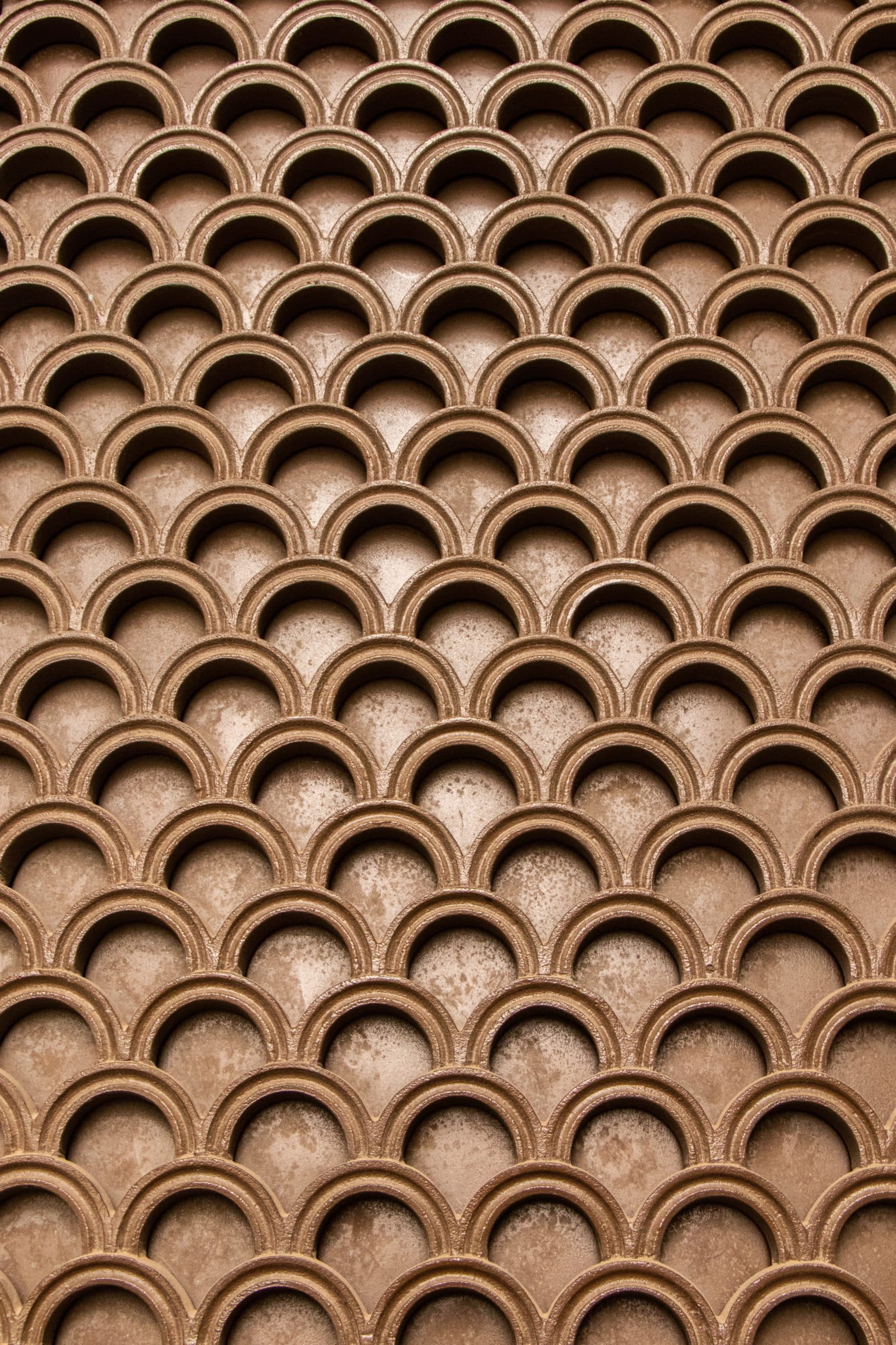
Once our icons were complete and approved by the client, we were able to explore different ways the icons could be used. We experimented with turning them into a pattern and using them in a more playful way in certain areas of the product, which reinforces the visual language by using icons the user has already interacted with.
As designers, creating icons is a really fun exercise! Seeing people’s reactions to the different icon options, and narrowing them down to a set, is very satisfying. At the beginning of our project, our client asked us: “Are these icons unique? We’re not going to see these elsewhere, right?” It feels great to show off the finished work and say: these are just for you.