
last updated March 29, 2017
“Typography is the art and technique of arranging type to make written language legible, readable, and appealing when displayed.” – Wikipedia
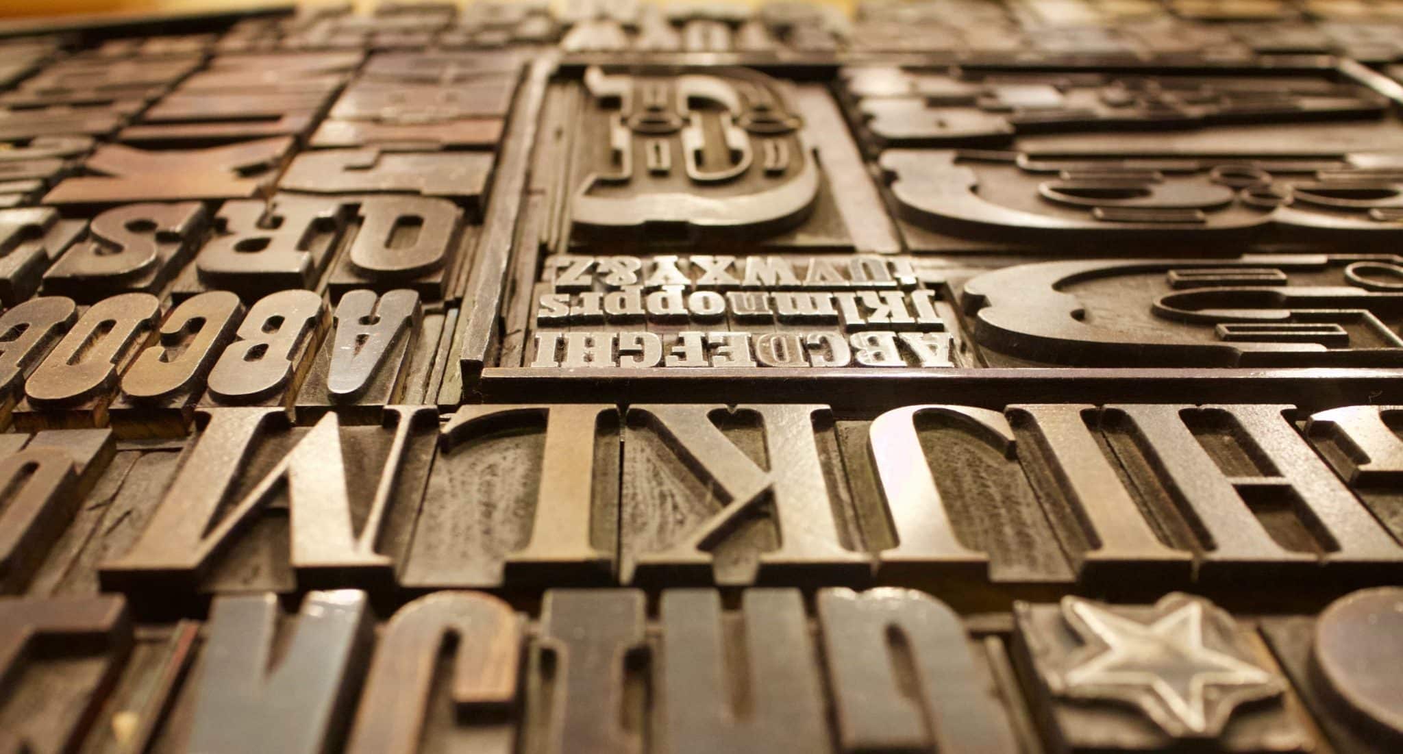
Typography could be considered the personality of an app: it is sassy, LOUD, creepy , a little silly. There is a craft behind letter kerning (spacing between characters), line spacing (leading), font face (sans-serif or serif), sizing in picas, and more! On top of the centuries of practice that humans have put into typography, we have a whole new set of rules to apply to our fonts when displayed on a screen. We have moved from stone/wood carvings, to the printing press, to code renderings. When fonts don’t display properly, we need the tools to make adjustments as necessary. Here is how Ftxdumperfuser can help!
The following directions require an apple developer account. There are probably other tools, but I used Apple’s FontSuiteTools to get the job done. An alternative may be found on FontForge. If you have this problem, speak to your designer first!


The problem: The custom font’s ascender property is too small compared to that of system font. Ascender is the vertical whitespace above a font’s characters. Ascender is a stem on a lower case letter which extends above the x-height. “l” has an ascender. This makes our font look totally off center, not at all appealing.
Set up: You have added your custom font to your app and you are experiencing a similar nastiness as the image above. I know adding the font was a pain and no one wants to mess with them for another moment, but right now it is necessary. Follow the steps to fix.
Step 1: Download Font Tools for Xcode from Apple’s developer dashboard. Test that your command line can run ftxdumperfuser. You should see the list of options.
Step 2: Run ftxdumperfuser -t hhea -A d path_to_font/Bold.ttf. Note the argument d for ‘data’ or dumper. This will generate an xml file of the font’s horizontal header table (hhea) containing the adjustable properties. Adjust the vertical ‘ascender’ property. I eye balled it and made the number bigger. Maybe someday I’ll want to learn more about calculating these vertical metrics.
Step 3: Run ftxdumperfuser -t hhea -A f path_to_font/Bold.ttf. Note the argument f for ‘file’ or fuser. This command will merge the changes from the xml file to your TTF font file. The resulting TTF font is now ready for use.
TA-DA!


I hope you aren’t experiencing this issue and are just reading this post for fun, but if you are in need of hhea property alterations, I hope this helps.
Caveats: I’m experiencing this problem in my iOS simulator for a react-native app. iOS and android are displaying this font differently and they are both messed up. In fact, they had the opposite font spacing problems. While iOS lacked the necessary bottom spacing, Android had too much. It was off center in the opposite direction. I would check all devices if using a custom font.
Tandem is chicago custom software development company with practice areas in digital strategy, human-centered design, UI/UX, and web application and custom mobile development.


