The portal behind every Motorola customer's daily operations.
Motorola Solutions builds the radios, dispatch systems, body cameras, and command-center software that public safety agencies, enterprises, and government bodies depend on around the world. Their customer base spans more than 100,000 organizations: city police departments, federal agencies, major industrial facilities, and space programs among them.
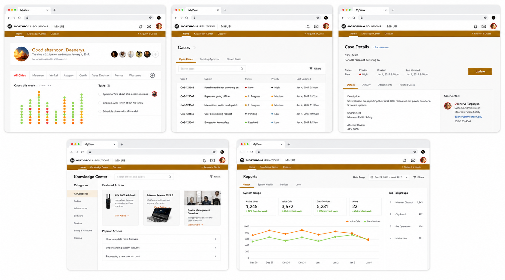
At the scale of a large customer, a single deployment can involve thousands of individual products. Hundreds of radios. Multiple dispatch consoles. Camera networks. Telecommunications back-ends. Each piece had its own management interface, its own status indicators, and its own corner of the operations team's attention. What customers actually needed was one place to see the whole picture: what's deployed, what's healthy, what's nearing end of life, and who's using what.
Motorola had built a portal called MyView to solve exactly that problem. Over time, though, MyView had become the very thing it was meant to fix: fragmented, hard to learn, and difficult to extend as new product lines came online. We were brought in to lead the redesign and help rebuild it from the ground up.
A portal meant to unify the operating picture had become its own source of fragmentation.
MyView's promise was a single operating picture. Its delivery was a collection of disconnected screens that each made sense on their own and made very little sense together.
IT and operations teams at Motorola's largest customers ran into the same patterns over and over. Different parts of the portal used different design languages. Status indicators didn't mean the same thing in different places. The information architecture reflected Motorola's internal product org chart instead of the questions a customer was actually trying to answer. New employees took weeks to find their way around, and seasoned ones built personal cheat sheets just to keep track of it all.
The other problem was extensibility. Motorola's product line keeps growing. Every time a new category came online, someone had to figure out where it slotted into MyView, and the answer was almost always "nowhere clean." The portal had no foundation that could absorb new products without splintering further. Each addition made the next addition harder.
Talk to the people running the deployments. Then design for their questions, not for the org chart.
We began with field research. The IT and operations managers running large Motorola deployments had specific, practical questions every day, and the redesigned portal had to make those questions easy to answer. Everything else followed from that.
Field research with the people who run the deployments
We spent time with IT and operations managers at agencies and enterprises that ran large Motorola deployments. The kind of customer who has 800 radios across three precincts, a city-wide dispatch system, and an aging back-end that's halfway through a multi-year refresh. Their daily questions were specific: which radios are due for swap-out, which subscribers are assigned to which devices, which networks are showing degradation, which products sit inside or outside their support window.
The research finding that mattered most? Customers didn't want a "modern" portal. They wanted a portal that matched the questions they were actually trying to answer. So that's what we set out to design.
Information architecture, top to bottom
The original MyView had organized information around how Motorola built products. We reorganized it around the questions customers asked. Network health. Product lifecycle. Subscriber assignments. Service tickets. Deployment inventory. Whatever the question, the answer should be no more than two clicks away.
We mapped the new IA against every existing screen and every product category on Motorola's roadmap, looking for the structure that would still hold up three product launches later. The work was as much about what to leave out as what to put in.
A shared design language
A unified design system replaced the patchwork of styles that had accumulated over the portal's life. Components, status indicators, navigation patterns, and interaction conventions all got pulled into a single library. The work wasn't decorative. Every component decision came back to the same question: does this make a customer's job faster, or does it just look nicer?
By the end, status meant the same thing in every screen, alerts behaved consistently, and the rules for adding a new view were written down rather than improvised.
Built to absorb the next product line
The architecture we delivered treats new product categories as first-class citizens. When Motorola adds a new platform to their portfolio, the portal has predictable patterns for slotting it in: where its data flows, where its status surfaces, where its subscribers and lifecycle information live.
The aim was to build something that gets stronger as Motorola's portfolio grows, not weaker. Extensibility had to be a property of the foundation, not an afterthought every time a new product showed up.
Fragmented to unified
The original MyView surfaced each product category through its own screen, its own data model, and its own visual conventions. The redesigned portal pulls those threads into a single coherent surface, with predictable slots for whatever product lines come next.
A portal that reflects how customers actually run their deployments.
The redesigned MyView pulls deployment inventory, network status, subscriber assignments, and lifecycle data into a single coherent surface. The navigation maps to customer questions instead of product silos. And the foundation underneath was built to absorb new product lines without rework.
One portal, every product line
Customers running deployments that span radios, dispatch consoles, telecom back-ends, camera networks, and command-center software now see all of it in one place. Status indicators behave consistently. Inventory and lifecycle data sit alongside health and assignment data, so a manager can answer a question without changing screens to find each piece of the answer.
Information architecture organized around customer questions
Every top-level navigation choice maps to something a customer is actually trying to answer. What's broken right now? What needs to be replaced this quarter? Who's assigned to what? Which networks are showing degradation? The portal reflects how the work gets done, not how Motorola is organized internally.
A foundation built for what's next
Adding a new product category to the portal no longer means rethinking the navigation or shoehorning data into an existing screen. The IA, the design system, and the front-end architecture all expect new product lines to arrive. Each one has a predictable place to land.
A foundation that gets stronger as Motorola's portfolio grows.
The redesigned MyView is in use across Motorola's customer base. Here's what changed.
The original MyView had grown into a portal where finding the right answer often meant knowing which screen had been built by which Motorola team. The redesigned MyView turns that on its head. The navigation reflects the customer's mental model, status semantics work the same everywhere, and the IT and operations managers running large deployments have one place to go for the questions they ask every day.
The harder-to-quantify result is the foundation. Motorola's product line keeps growing, and the redesigned portal was built with that in mind. New categories slot into existing patterns rather than fragmenting the experience further. The work we shipped wasn't just a better MyView. It was a MyView that gets stronger as Motorola adds to it.